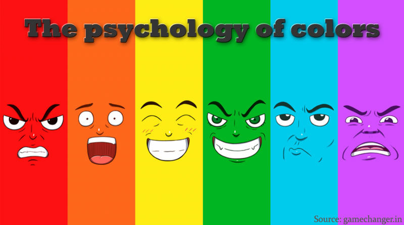
Color Psychology – How brands use Colors to influence you!
Colors play a significant role in human psychology and brands of all types have taken the edge for improving their sales. It may seem odd but the significance of colors in how people perceive different products is very crucial. This is known as color psychology, a science that tells companies which colors to use to influence consumer behaviour.
Different colors strike differently hence some colors trigger assurance while some incite rage and energy, for example, the color blue soothes the mind of the human and gives a sense of reliability.
Studies show that Blue color seems to lower the blood pressure levels giving the customers calmness as it is associated with tranquility and stability, therefore many big financial institutions and tech-based companies often use the blue color because no one wants any tech gadget to be unstable hence promoting sales indirectly.
Color psychology behind Red color
Red is a color that grabs attention. It triggers action. If your design isn’t all red, a bright red, then you might as well use a red ‘buy now’ button because that works great.
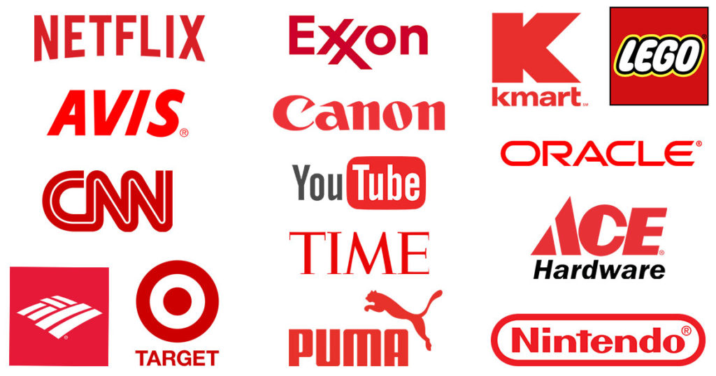
Where is it seen?
Red attracts people. Red is great for impulse purchases, which is exactly why it’s a common buy button choice on websites. This is comparatively more effective for B2B software vendors too but then again Coke, Levi’s, Exxon, Lays and Red bull are great examples of what red color can do for a b2c brand.
Color psychology behind Blue
Blue helps with boosting sales indirectly. As compared to red, blue tries to trigger nervous system arousal – it makes people want to sit up, notice, and make them realize that now is the time to buy. It’s the opposite for blue, instead of excitement, the color creates the urge to end the anxiety.
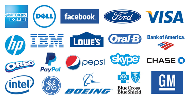
Where is it seen?
It is seen mostly on financial and insurance websites. A light blue tends to gives them a sense of freedom and security, on the other hand, darker blues indicate tradition, seriousness and intelligence. Paypal works with both light and dark blues. Other financial websites tend to go with royal and navy blues to show sober security. In terms of logos – Samsung, HP, Ford, Intel, Dell and IBM also use blue color to instill confidence in their brand.
Color psychology behind Green
Green is the color of the environment, it is all about natural, organic, environment friendly. It is a natural choice, of course, for businesses that are organic. It is used to appeal to similar audiences or people with similar interests, even if there’s no direct connection.
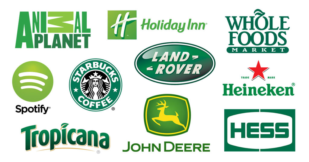
Where is it seen?
Green makes a solid CTA (call-to-action) and is definitely great for the buy button. In the brick-and-mortar world, it is no surprise that brands like Wholefoods, Starbucks, Tic Tac, Sprite, Subway and even Carlsberg use green color in their logos to give a subtle message that their products are safe to consume.
Color psychology behind Purple
A bright color indeed, It compliments both yellow-green and is analogous with pinks and blues. The best use for this color is with lots of white and black. It can be used for branding, menu items or conversion elements.
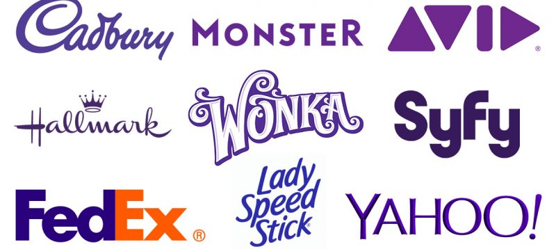
Where is it seen?
Purple is a standout color, it is best for branding. A website with a muted blue – cream – brown color tends to convey seriousness and capability. This is why it is best for financial businesses, but educational organizations. It isn’t just the Cadbury’s, Wonka or Hallmark from the brick-and-mortar businesses but even new age ones like yahoo and monster have chosen purple.
Color psychology behind Black
Black isn’t great with making conversion elements as it is comparatively tough other than just as an outline. But black and white give the best contrast. Squarespace uses a white button on their black backgrounds
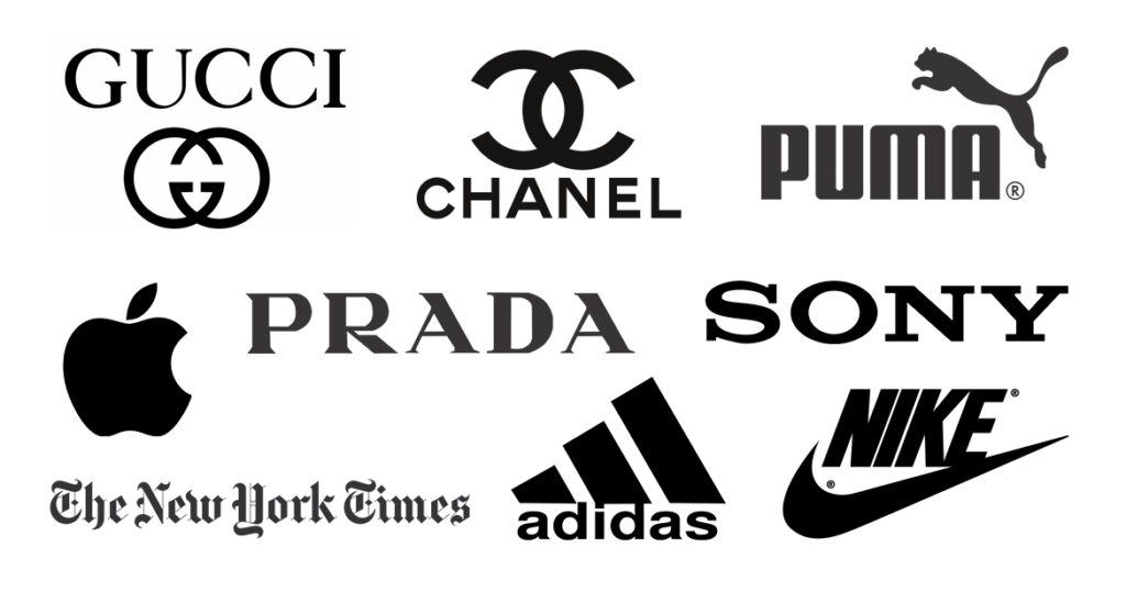
Where is it seen?
Male-oriented luxury brands tend to use black a lot, such as Rolls Royce. Gucci, Prada, Apple, Adidas, Nike, Puma and many other premium brands also use black to give a sense of exclusivity and elitism to their consumers.
Color psychology behind Orange
Orange is best used when you want your brand to look clean and simple. It tends to stand out and the color makes people feel positive about the brand– this color works for both men and women.
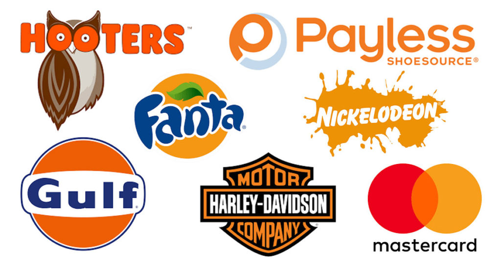
Where is it seen?
Penguin has orange branding and orange subscribe buttons. Basically, everything clickable on the page is orange. And check out how Blogger uses orange. It’s a classic, simple signup page. But it’s also a background slider. As the slider turns, we see two more background colors. Besides, brands like Dunkin, Fanta, Harley Davidson, JBL and even Amazon use orange in their logos to make the consumers feel the energy of their brand.
Well, this isn’t why we designed Piccle logo in orange, we just found it to be cooler 🙂
It is interesting to see how colors have a huge impact on the type of brand you are going for. Colors are effective because as they create a sense of urgency, others tend to soothe the anxiety. Which of these surprised you the most? Do let us know in the comments below.
You may also like it
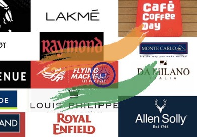
Brands You Didn’t Know Were Indian